Last year I wrote about my late night maths with UK-WHO baby growth charts after the birth of my daughter Florence.
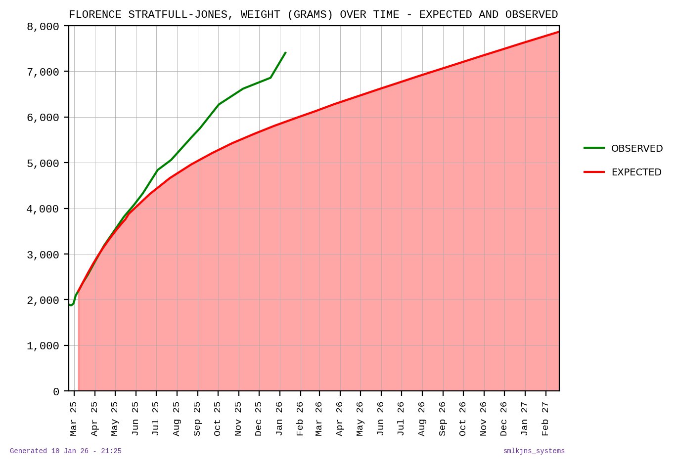
Since then, Florence has been growing at an excellent pace and has been significantly exceeding the expected trend for her starting weight. She’s almost 11 months old now and is now in the 10th weight centile, thanks to what has evidently been a lot of catching up. We’ve been able to track this trend well thanks to (Soph) getting her weighed relatively often, giving us a good number of new data points. So armed with those additional data points, I’ve returned to do some more work on the topic, though this time more as a bit of fun than from a position of anxiety.
To start, here’s her latest weight trend against the expected trend I’d previously calculated, this time plotted with matplotlib and with linear interpolation for every date between known values. (can you spot when she got a chest infection?)
A common game in our house is trying to figure out when Flo will fit into a given item of clothing. With that in mind, I thought it would be useful to have smlkjns_assistant be able to answer queries based on this data about when she’ll reach a given weight, or what weight she’ll be on a given date.
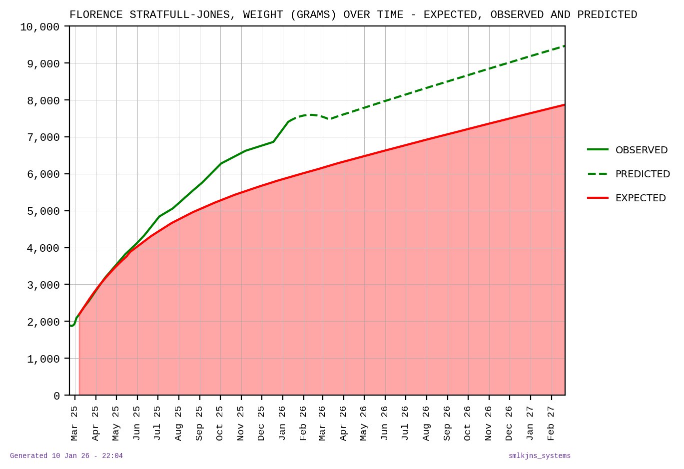
To do that I need a method of predicting her future weights. Given the gap between observed and expected has continued to widen as she’s caught up, I had to make an assumption about how this gap would continue to play out. Assuming no further catching up, or in other words no further widening of the proportional gap, seemed at first to be the most conservative realistic option. Having charted this however it showed, naturally, an implausibly immediate deceleration.

Next I tried a transition starting from the velocity of the widening as of the most recent observed values and gradually falling back to the average proportional gap observed over the past two months. This was a profoundly stupid idea because if I had stopped to think about it I would have realised this curved transition implied growth that started fast but then had to stall and even reverse to line up with the more conservative long term trend.
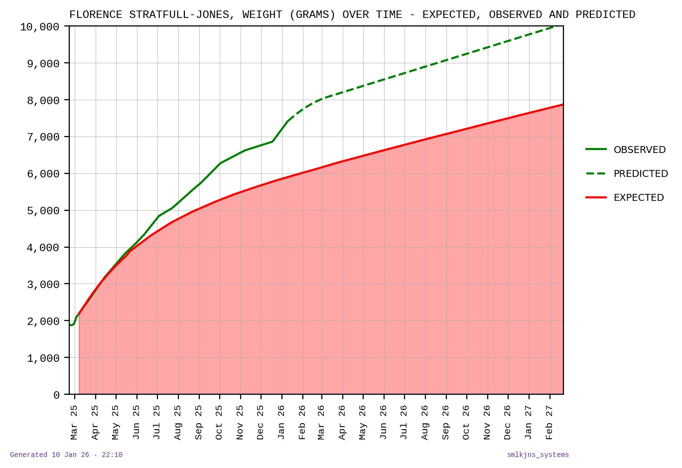
So having had some more coffee and with a few more brain cells engaged, I settled on a curved transition from the most recent velocity of the widening to a longer-term average velocity of the widening. Or put differently, I assumed she would continue to catch up indefinitely but the pace of this catching up would slow from its current high. That looked much more sensible.
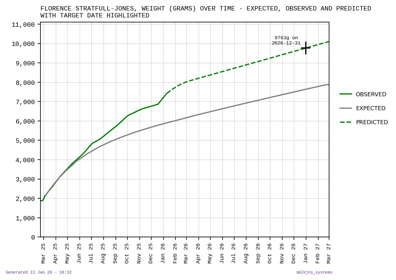
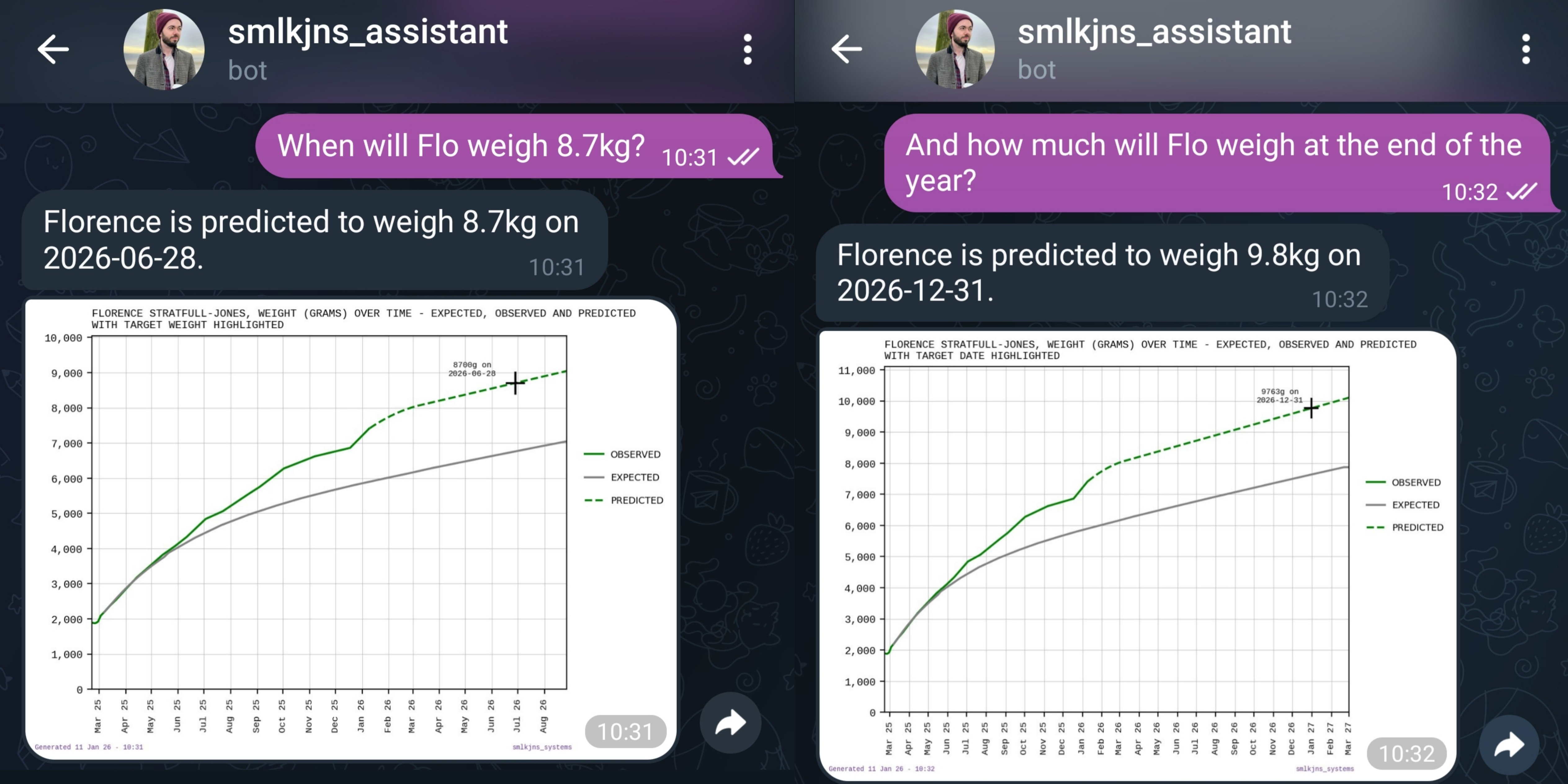
With a predicted trend worked out, I shoved my SQL into a dataframe and cooked up some code to find either the weight on a queried date or the first date that met a queried weight. This allowed me to annotate the chart to highlight the identified point as an answer to a given query, like so:
I wrapped this up into a new smlkjns_assistant function, connected it up to its existing date parsing logic to figure out a query date from a user’s message and wrote some new parsing logic to figure out a query weight if that was in the user’s message instead (for which I’m not ashamed to say I used an LLM – one of the few good things about the future is I will never again write my own regex).
An example of an arbitrary weight-based query and then a date-based query being answered by smlkjns_assistant:
So there we have it, a fundamentally over-engineered solution to a set of questions that could probably be answered sufficiently well with a ruler and some squinting, but I had fun along the way and Flo’s over the moon about the whole thing.